Mansfield Haus 028: Making more neighbourhood memories ↓
Family memories and easy indoor-outdoor living – nostalgia takes on a Palm Springs Modernist hue in this family home.
Words by Nicky Lobo
When Anthony and Madeleine became the next custodians of a block of land that had been in the family for over 50 years, they knew they wanted to create something out-of-the-box for their family home. Located in a suburb more used to 1970s brick homes and cookie-cutter volume builds than Modernist architectural commissions, the couple had higher aspirations for the elevated 807m2 parcel of land.
Anthony had himself grown up on a neighbouring lot after his grandparents had retired to the area in the early 1970s. They’d purchased the vacant block back then, and it became the cul-de-sac park, playground and backyard cricket pitch, as well as a spot for Anthony’s Dad to indulge in a bit of gardening. With Anthony’s parents now living in the house behind the block, Anthony’s sister and her family in the house next door, and many neighbours who’ve become long-term family friends, Mansfield Haus 028 was already nestled within a hub of family and community.
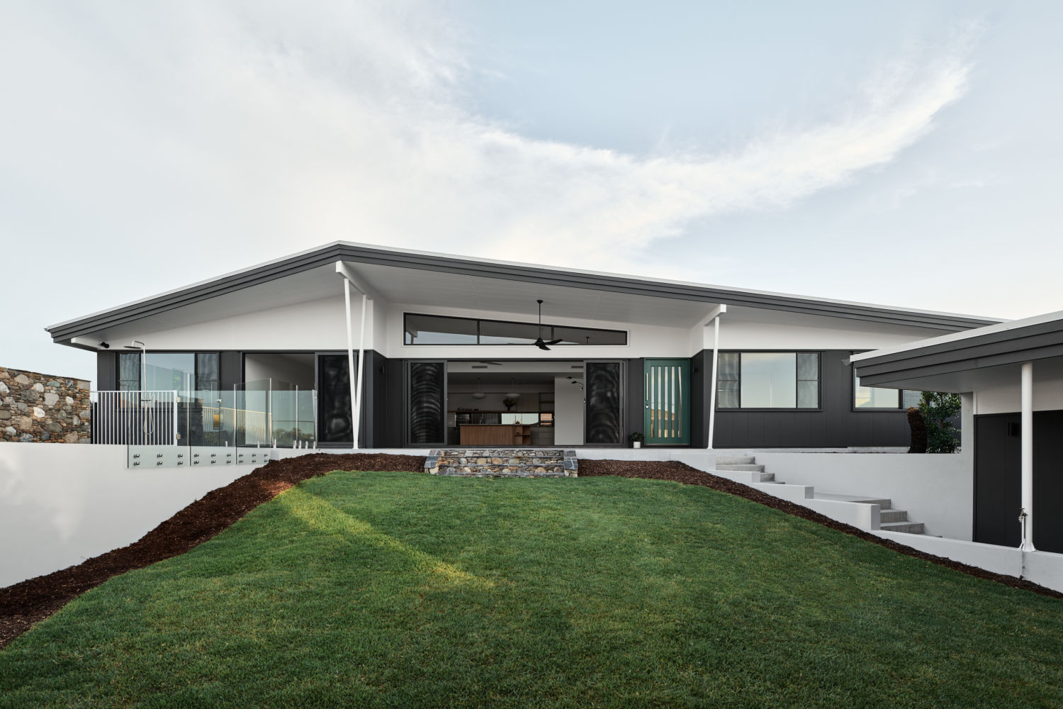
Having come across Happy Haus many years prior, when it came time to investigate architects and builders for their own home, Madeleine and Anthony re-engaged with the Happy Haus team at one of their completed projects to talk about what they wanted from their home. ‘The quality of all of the finishes and the approach to design, deeply considering the Queensland climate and liveability, were key factors for us,’ Madeleine says.
With Happy Haus, they ‘Really liked that we could have everything in-house, from architect to interiors and builder. We felt that this would manage some of the cost and design risks inherent in going with an architect and then tendering out the build.’ This multidisciplinary approach is what the company’s Managing Director Lachlan Grant refers to as ‘zero-gap service’, where all aspects of design, planning, approvals, estimating, and construction are managed by the team.
Architect Brooke Dunlop was paired with the couple for the project, and the team commenced research to inform the design approach. Conceptually, the clients’ love of the Palm Springs Modernist movement was a key part of the brief. The reference offered several inspiration points for the spatial layout, architectural features, detailing and interior styling, with Palm Springs and Brisbane sharing some critical characteristics.
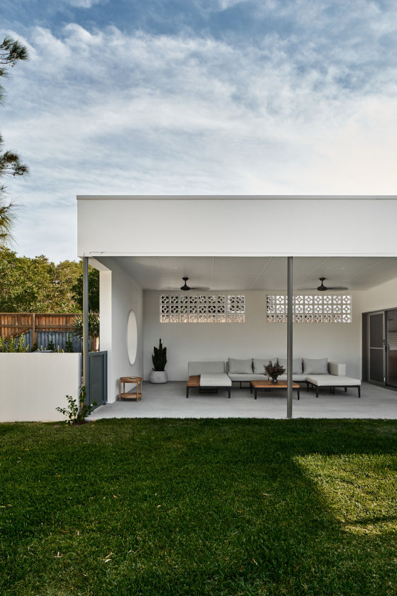
Climatically speaking, warm temperatures call for considered air flow, orientation and crisp, cooling finishes. Culturally, the easy-going Brisbane vibe echoes the appeal of Palm Springs Modernism, attracting those nostalgic for a less complicated time. Resort-like indoor-outdoor living, connection to views and generous use of glazing all feed into this particular aesthetic and experience.
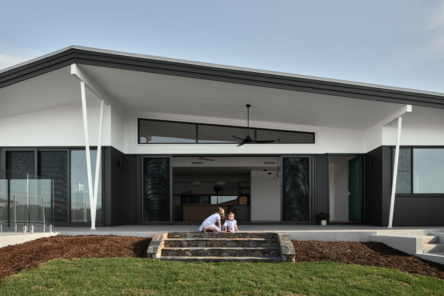
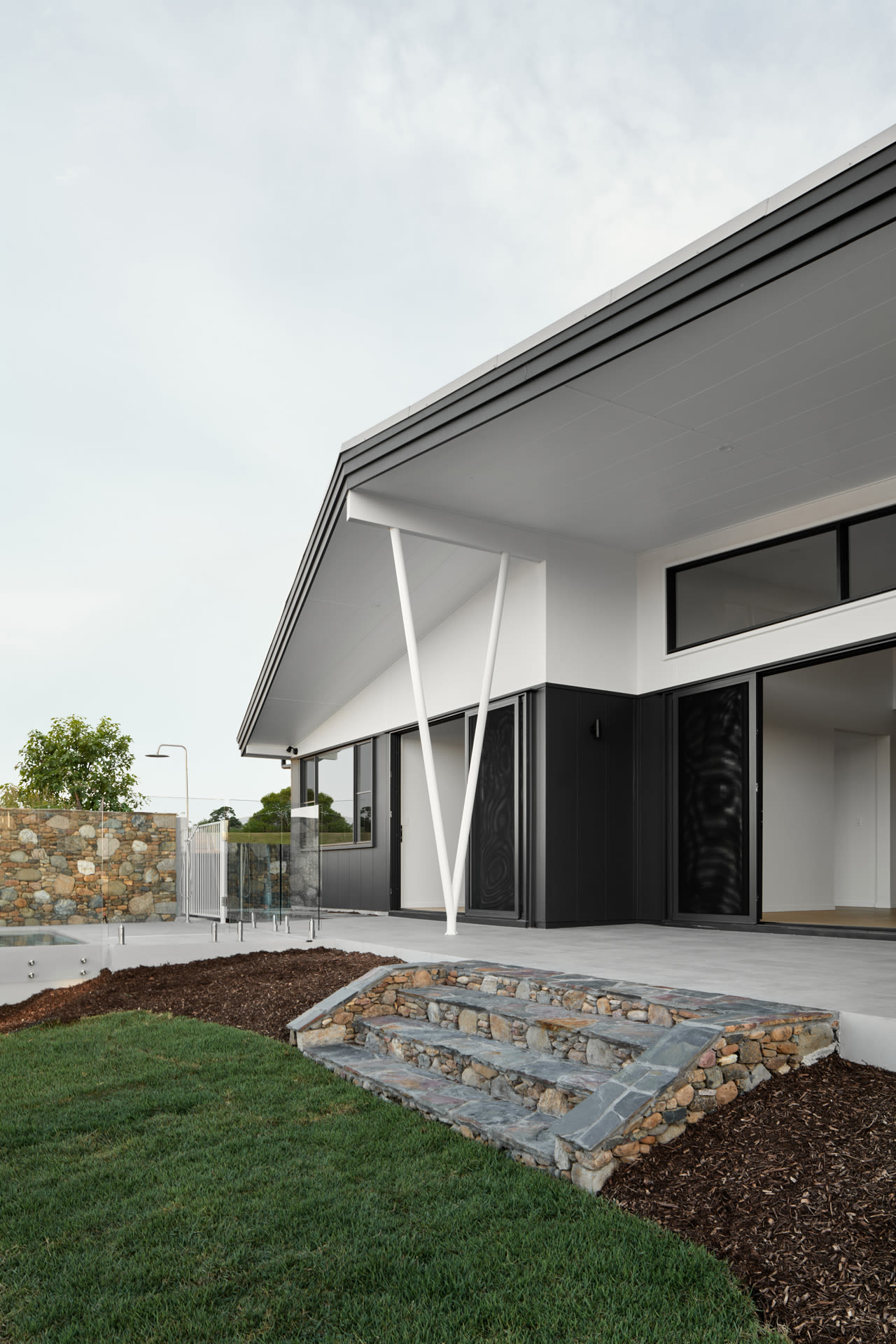
The generous elevated block, with expansive views to the north-west and glimpses over suburban Brisbane, provided good opportunity for capturing breezes and utilising cross-ventilation as a passive cooling mechanism. On the other hand, the site also had a relatively small frontage and irregular shape, which meant the spatial layout would not be straightforward.
In addition, typical Modernist projects are often slung low and single level across the landscape – however, replicating this on the steeply sloped topography of the Mansfield Haus 028 proved a challenge. Try as she might, Brooke noticed that single-level concepts were restricting the possibilities, in that ‘we weren’t maximising the best aspect of the site and were getting some disconnect of spaces.’
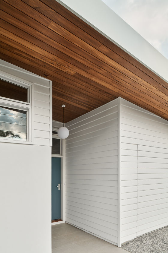
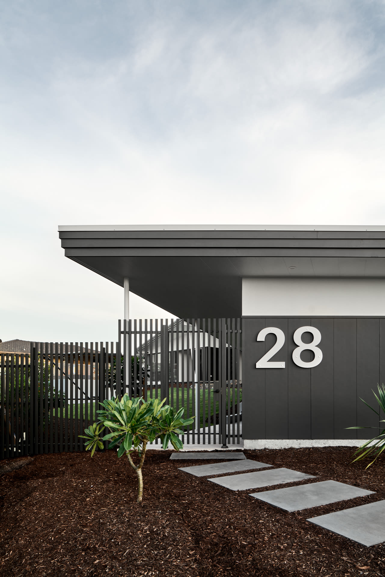
She realised she had to let go of this parameter, and instead allowed the house’s form to be directed by the site, ending up with two structures: the living abode hugging the rear boundary; and a detached garage, study, mud, and entry at the front of the site. This approach had several benefits: it created a sense of enclosure, captured views from all the living areas; and installed a sense of journey between home and the workspace – a key part of the clients’ original brief.
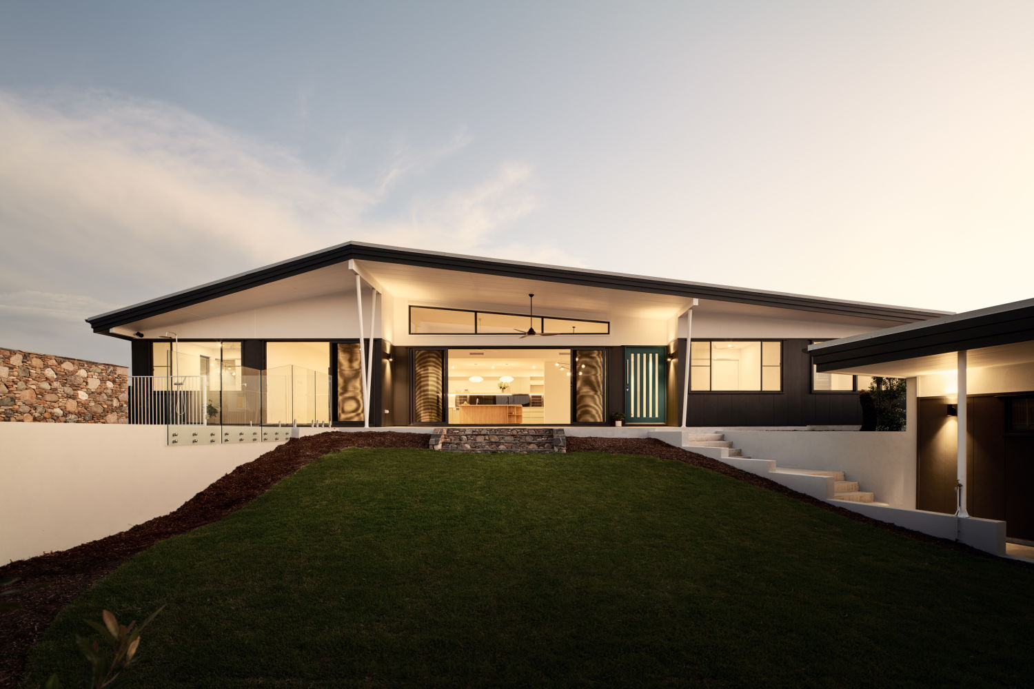
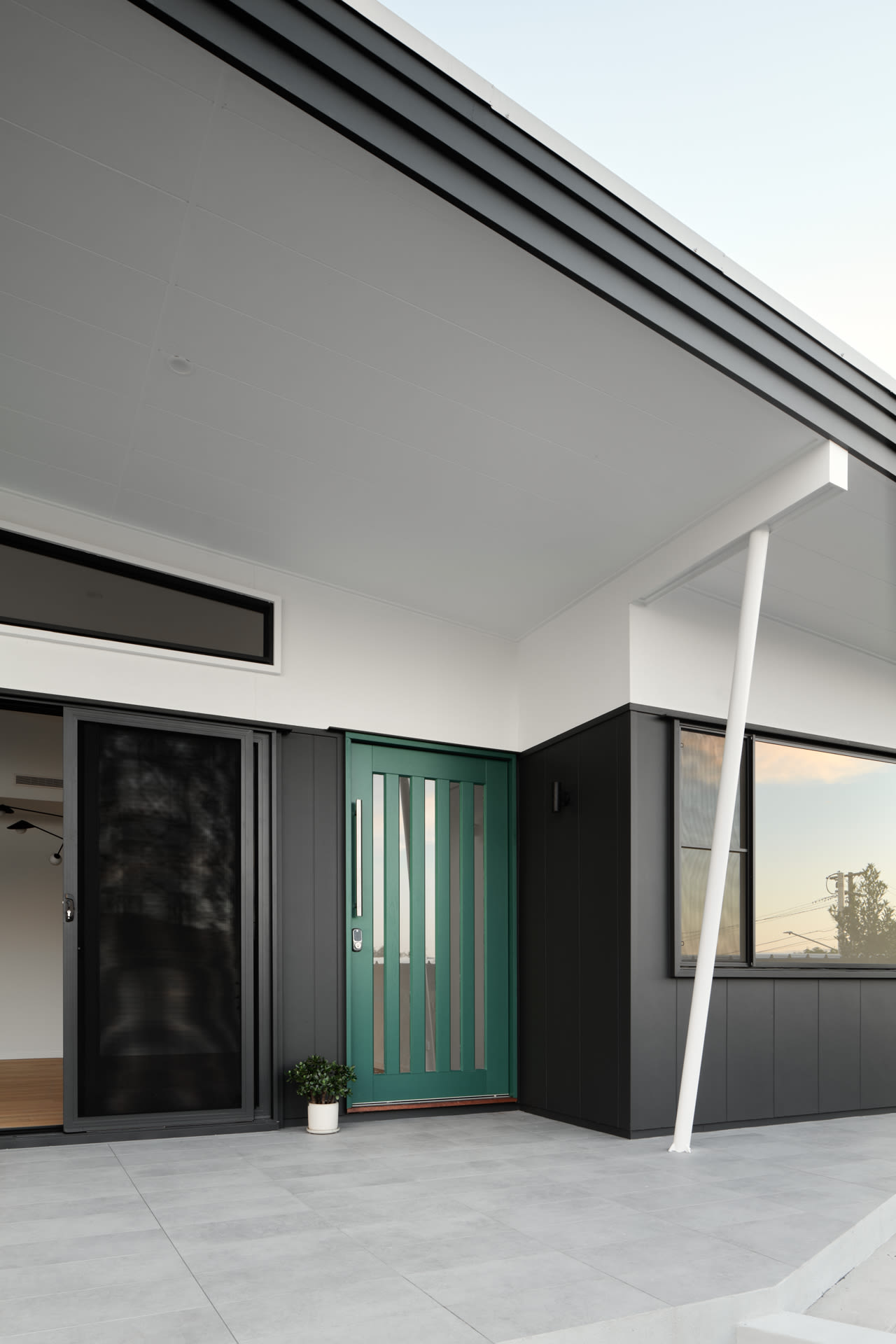
Another variation from the Palm Spring Modern aesthetic was the roofing. Rather than the typical flat Modernist horizontal line with clerestory windows providing a glazed break between walls and ceilings to give a ‘floating’ impression, Mansfield Haus 028 features a gentle variation of the quirky A-frame roof form. The resulting raked ceiling and generous glazing again increase the internal volume and perception of spaciousness.
Building orientation and room planning were carefully considered to ensure the comfort and efficiency of the family home. Minimising summer sun loading, creating opportunities for cross-ventilation, and coaxing as much natural light and aspect into as many rooms as possible were key strategies to meet the demands of sub-tropical living. These not only make the experience of Mansfield Haus 028 a pleasure throughout the year by mitigating seasonal discomfort but also embed sustainable outcomes.
Living spaces were designed as inside/outside hybrids to increase the liveable space, and louvres and ceiling fans coupled with smart orientation minimise the need for air conditioning. The cleverly pitched and oriented roof also means solar panels are perfectly positioned to capture renewable energy. Everything is designed and selected to ensure efficiency and longevity – whilst choosing long-lasting finishes, fixtures, windows, and materials sometimes costs slightly more in the beginning, Brooke explains, ‘in the long run, it ends up costing a lot less.’
Speaking of costs, the build took place during Covid—a particularly tricky time with constant cost increases and supply challenges—and was also hampered by 6 weeks of unseasonal rain. About the site challenges, ‘We felt Happy Haus were upfront with us as much as possible,’ share Madeleine and Anthony, ‘which helped us plan for the changes, and we felt we both took on the appropriate balance of risk’.
The other typical sticking point of a build—the timeline—was also unusually smooth. Though Anthony and Madeleine had heard stories about schedule blowouts dragging out for 18 months or more, they were pleasantly surprised. ‘The team did an incredible job to deliver in 10 months, despite weather and design challenges,’ they remark.
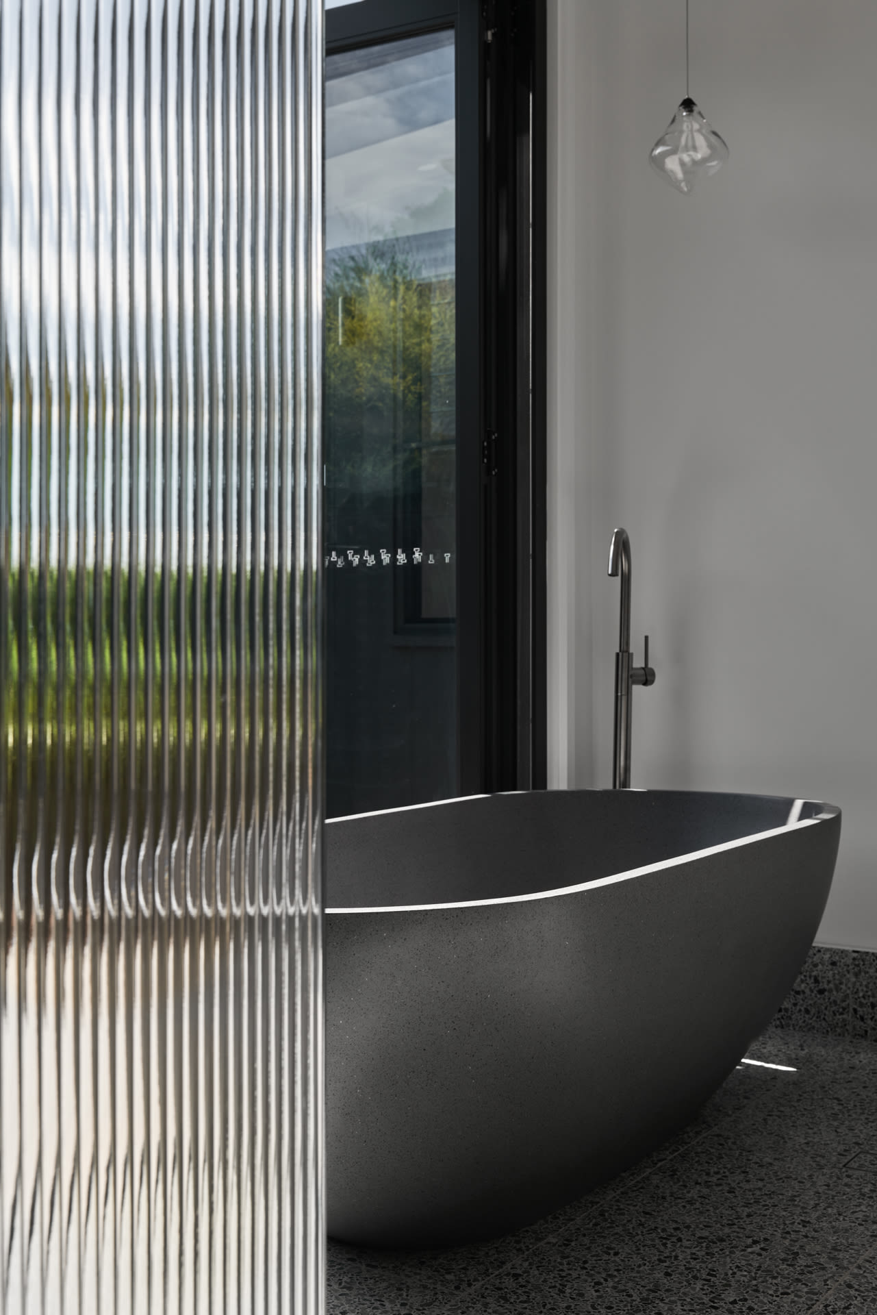
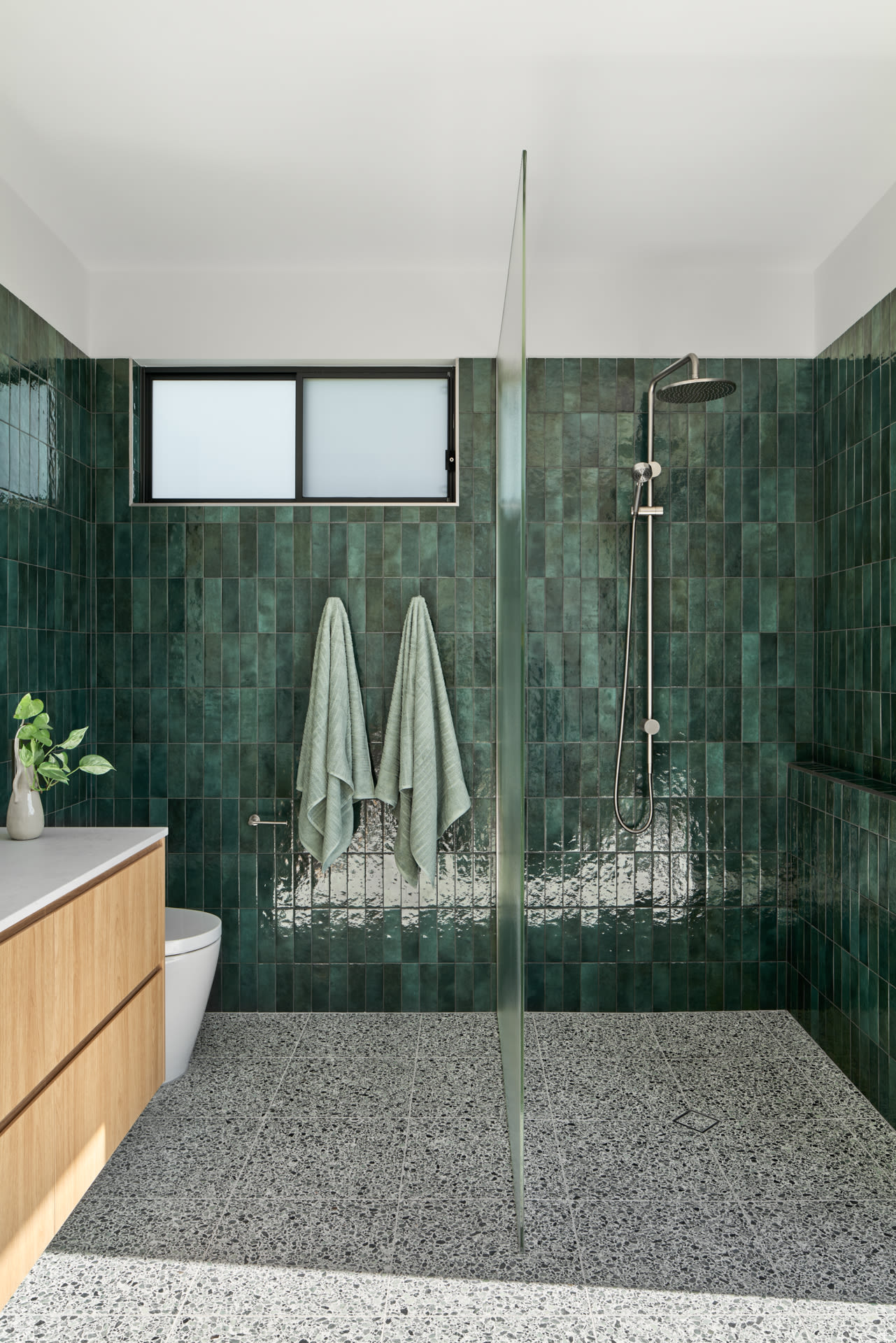
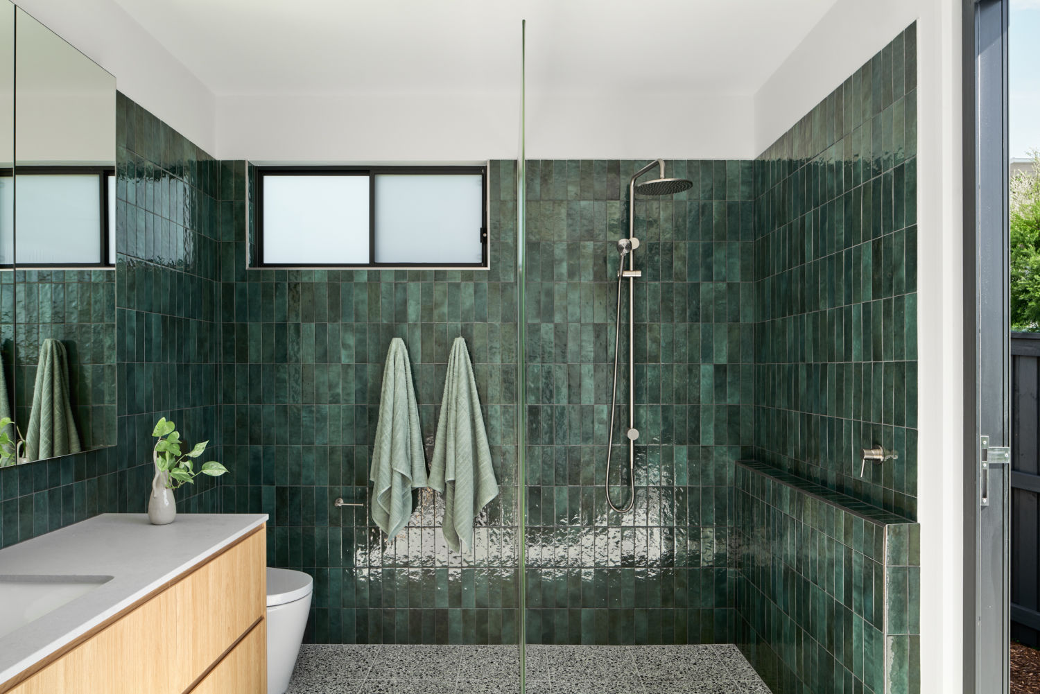
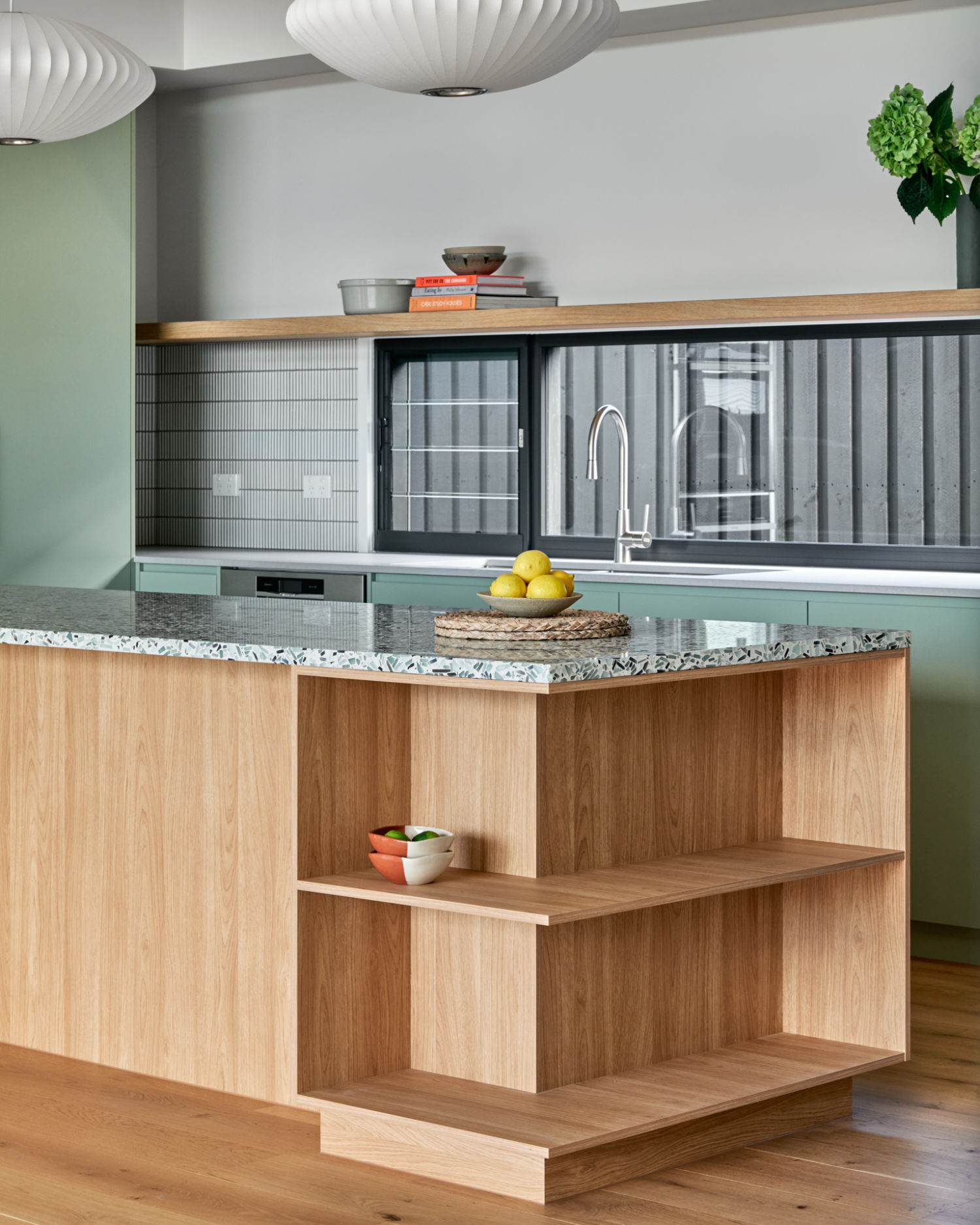
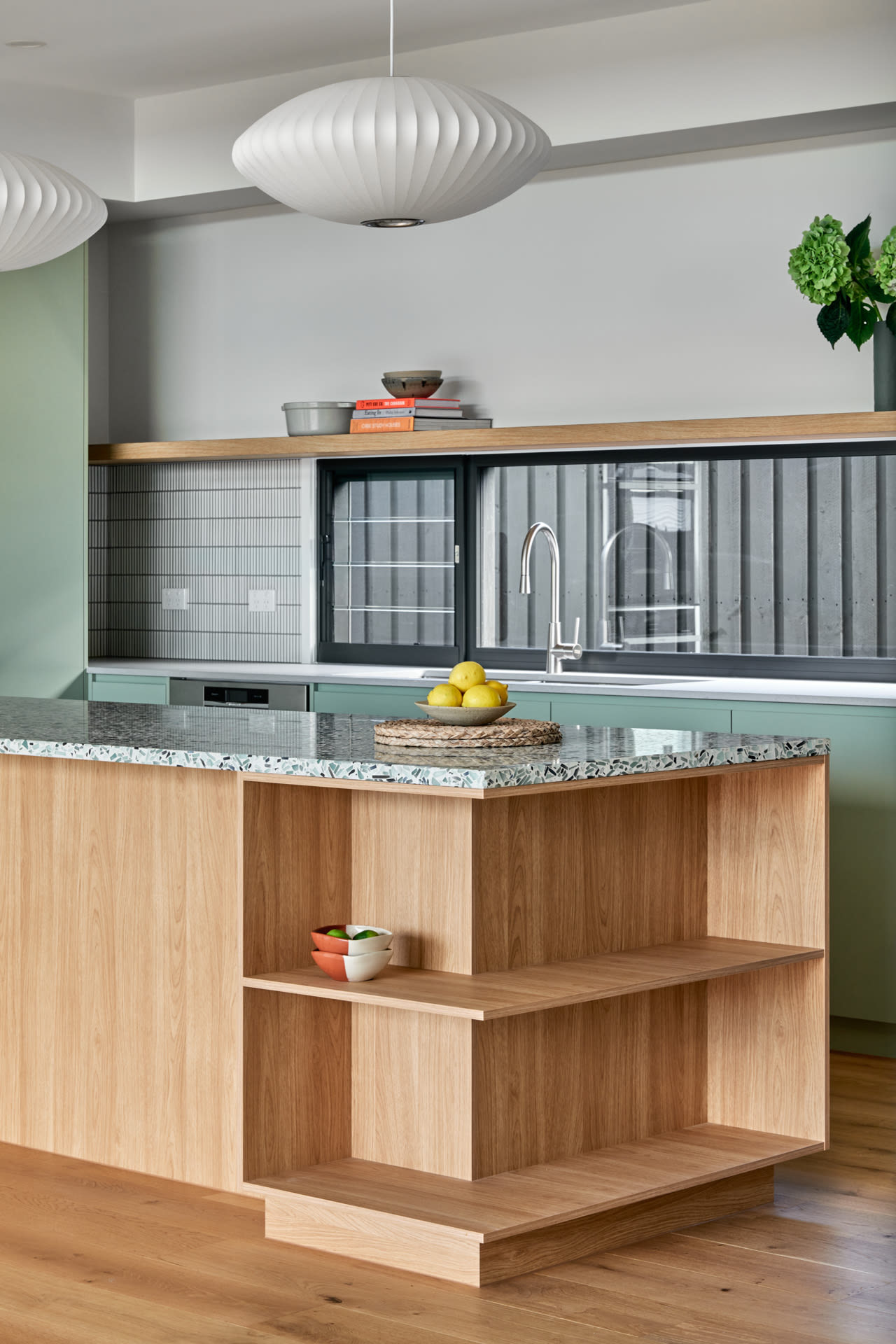
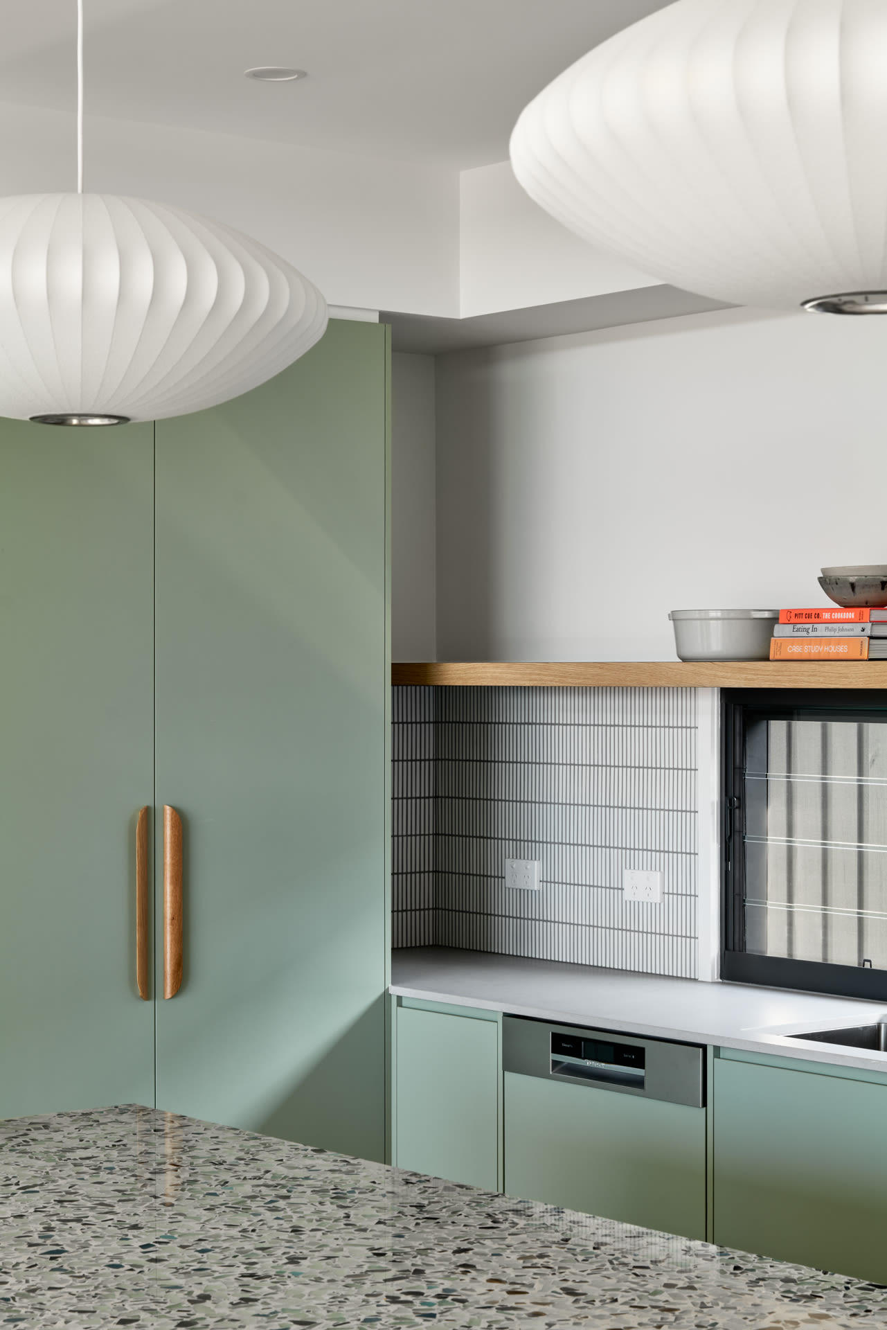
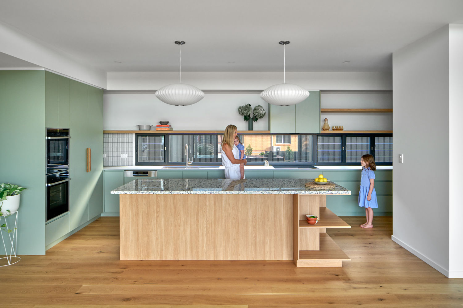
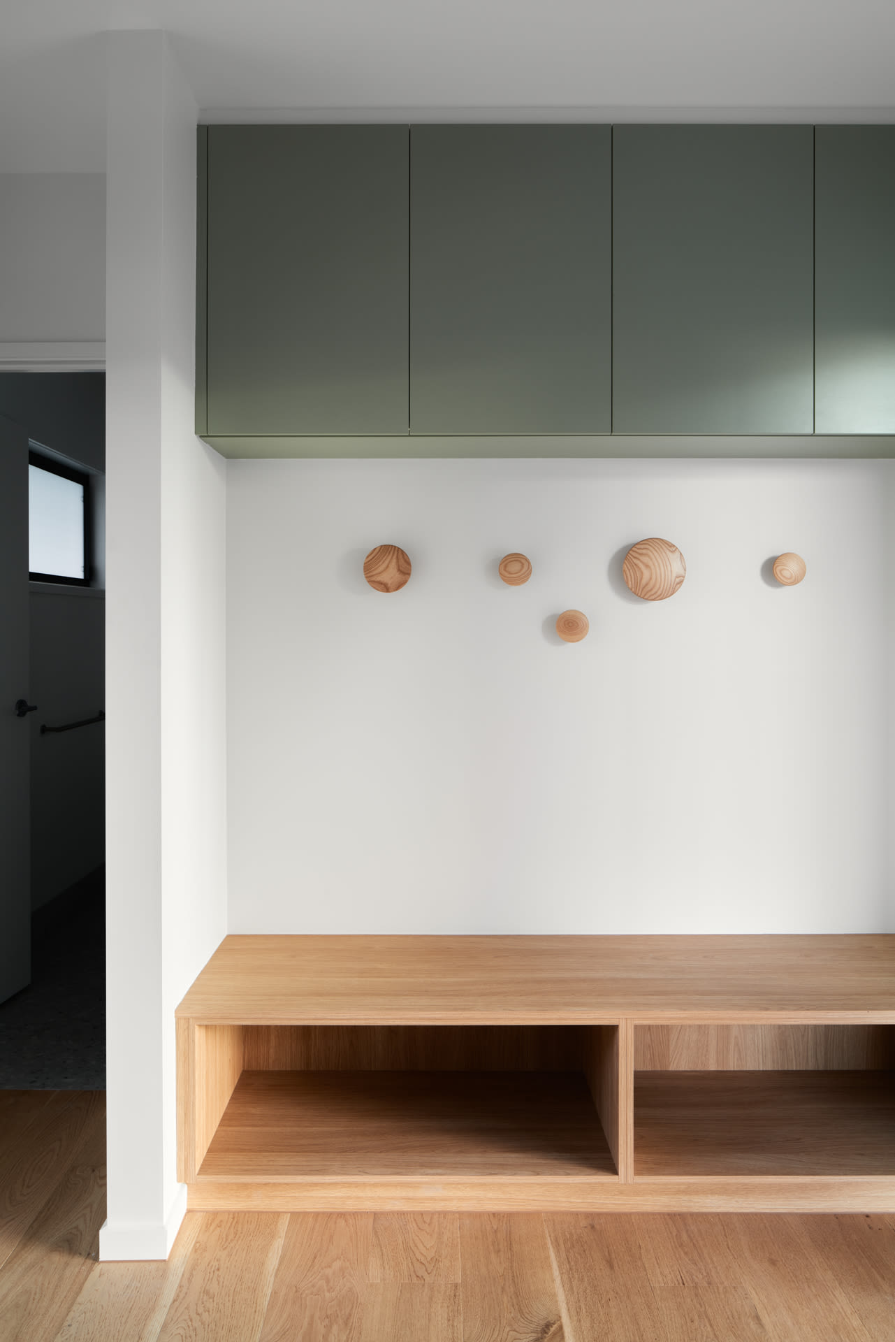
‘I love the colour we’ve been able to bring in through the cabinetry, tiles and paint choices, particularly in the kitchen and bathrooms,’ shares Madeleine. ‘This is so reflective of what I love – there is no way I could have a stark white house!’
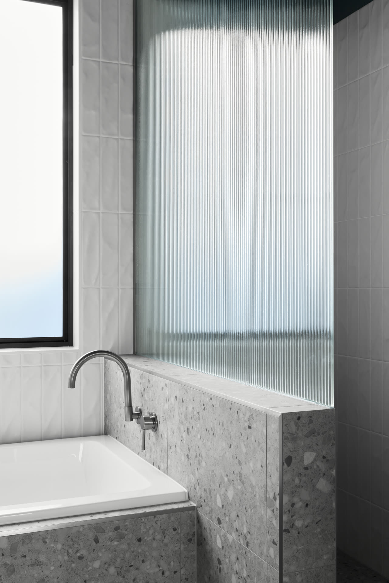
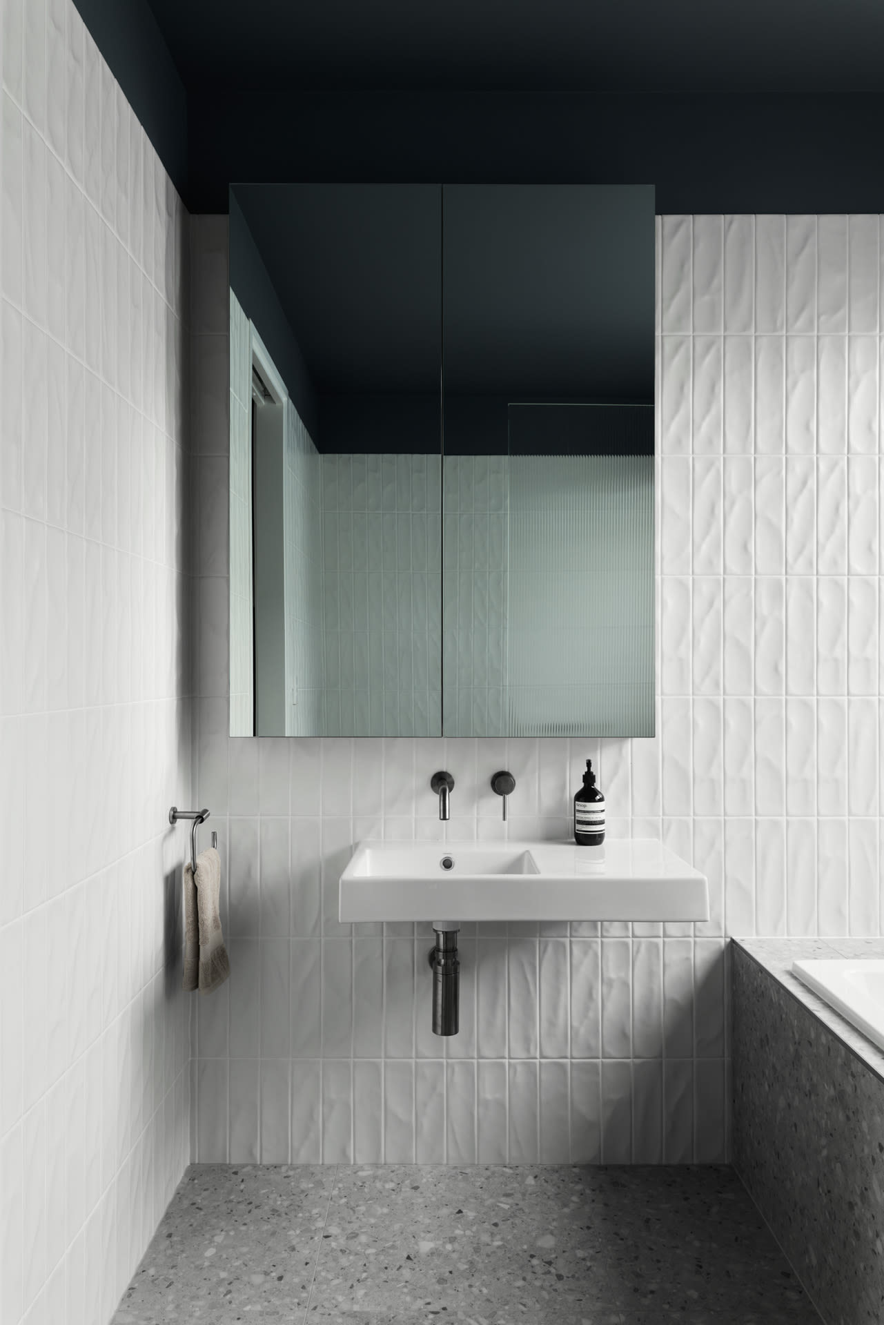
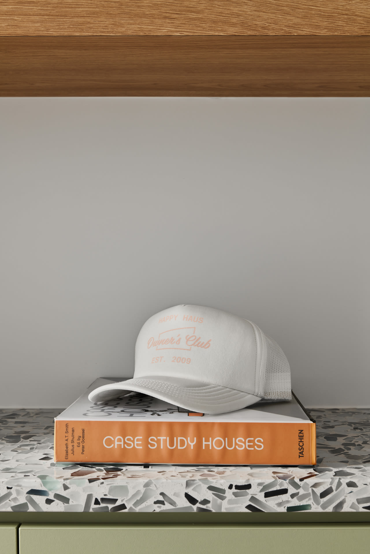
This project is very much a bespoke design, and Madeleine and Anthony were heavily involved in design decisions, which has resulted in a home that is full of their personality. Open shelving provides storage and display points for objects of both function and beauty; whilst nooks and ample wall space cater for the clients’ hero art and furniture pieces.
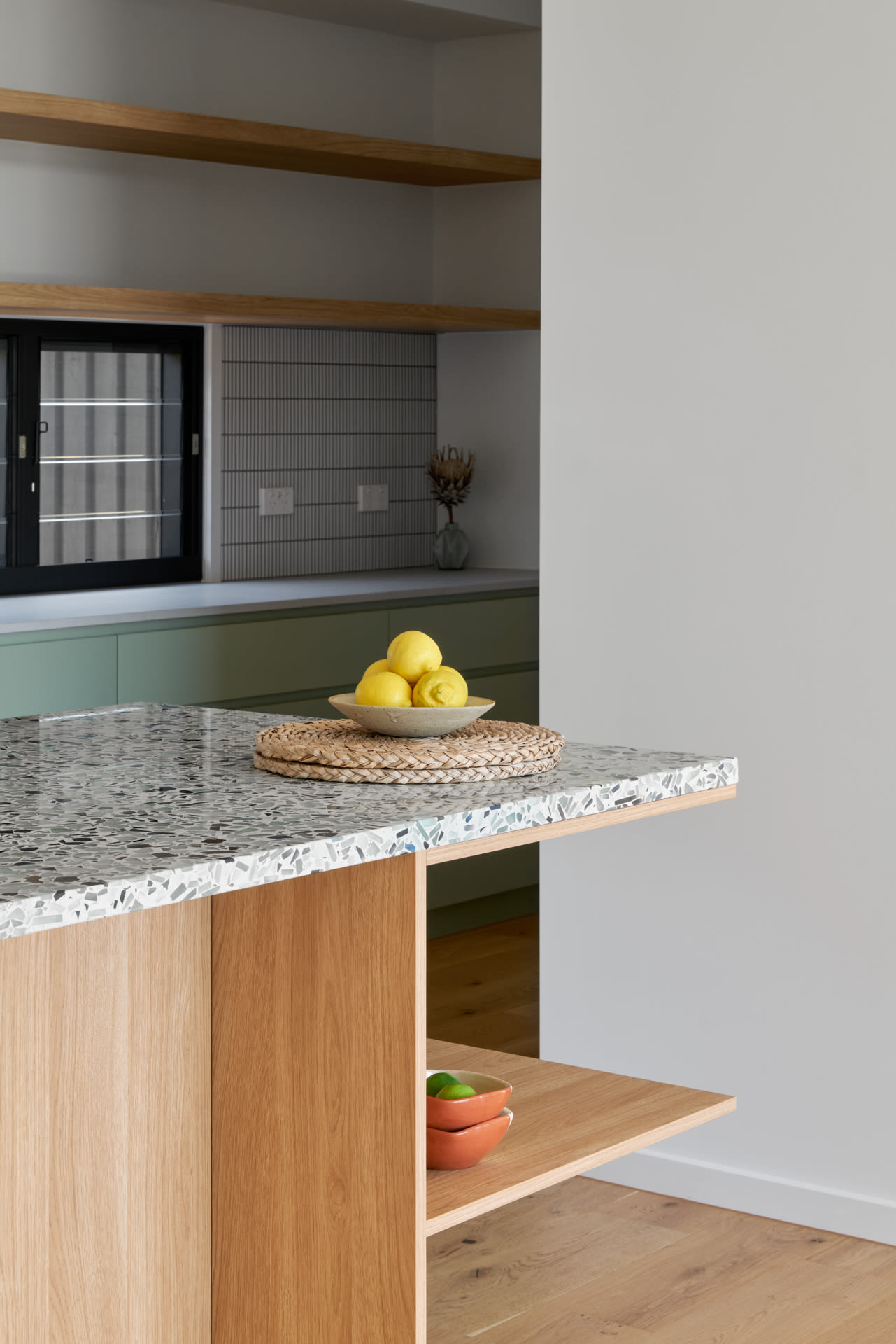
The suite of finishes echoes the clean Modernist styling, with hints of timber amongst crisp splashes of colours throughout the joinery, informed by the cool tones of recycled glass featured in the kitchen benchtop. ‘I love the colour we’ve been able to bring in through the cabinetry, tiles and paint choices, particularly in the kitchen and bathrooms,’ shares Madeleine. ‘This is so reflective of what I love – there is no way I could have a stark white house!’
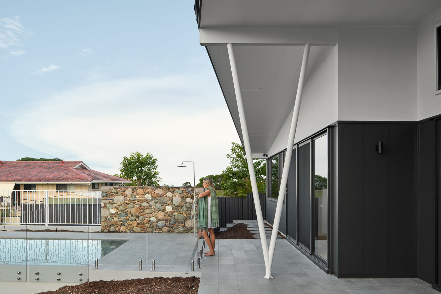
‘The breadth of sky and views has been such an unexpected joy, combined with how well it works for indoor/outdoor living,’ she continues. Anthony agrees, enjoying the openness and flow of the house. He says, ‘I love working from the separate home office and looking out across the garden with the feature stone wall and steps built from rocks we recovered from the site, and the original retaining walls built by my father.’
In Mansfield Haus 028, these layers of memory will continue to tell the story of not just the home, but also the people who live there – now and into the future.
